

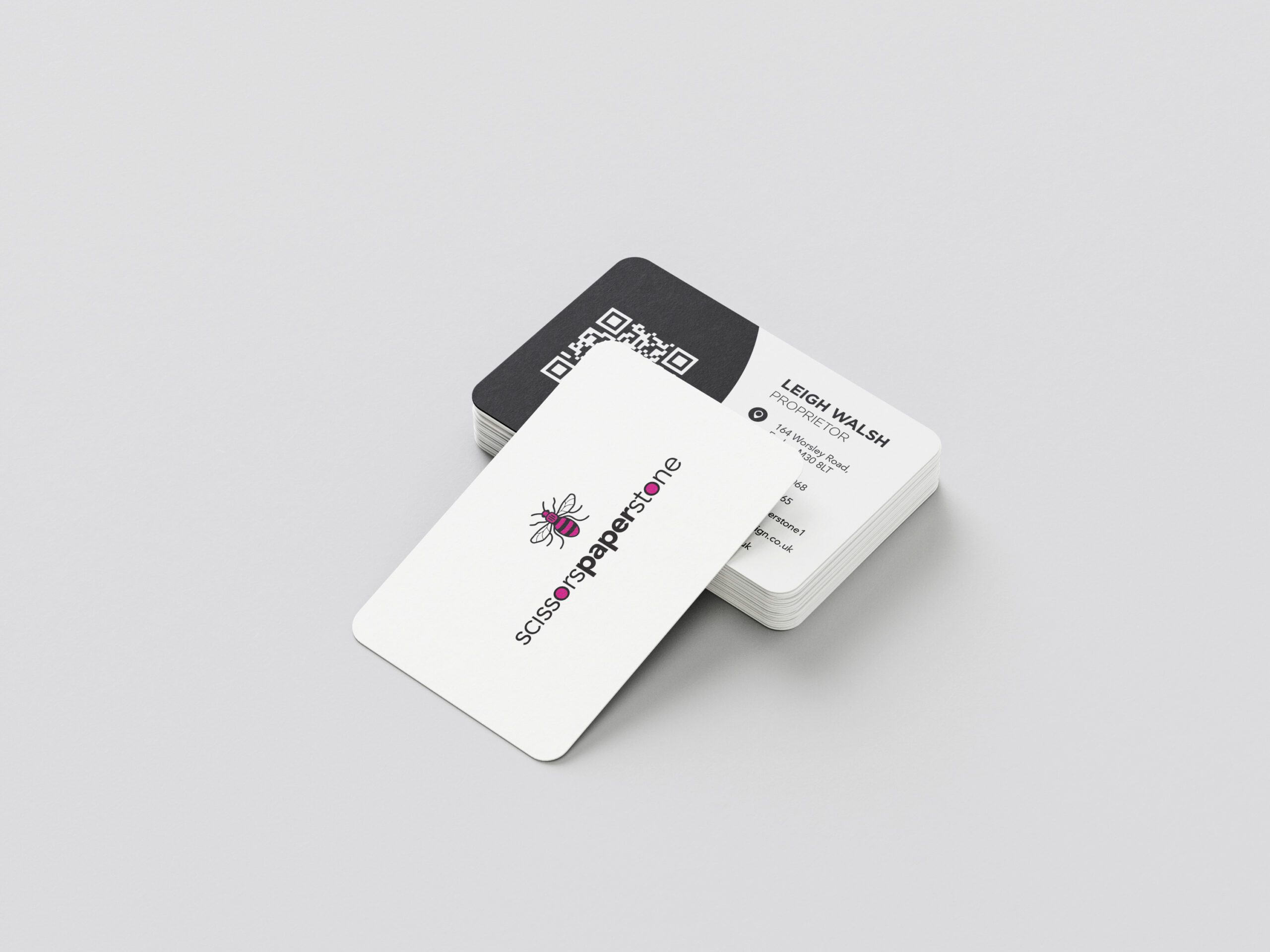
A business card does more than share contact details. It speaks for your business long after a meeting ends. A clear, well-produced card shows professionalism, confidence, and attention to detail in a way digital contacts cannot match. Many people still keep cards on desks, in wallets, or inside notebooks, which means the quality of that small piece of print matters. This guide explains the key elements that help a business card stand out and how a considered design makes a lasting impression.
Why clarity matters from the start
Clarity is the most important part of any business card. People often try to fit too much information into a small space, which makes the card harder to read. A clean layout helps the eye move naturally across the card, allowing the name, role, and key details to come through clearly. Strong spacing is essential. Adequate breathing room around text keeps the card readable and stops content feeling crowded.
Simple contact details also help. Listing a phone number, email address, and website is often enough. Long lists of social media handles or promotional lines take up space that rarely adds value. A straightforward, tidy layout is always more effective than a cluttered design.
The role of brand consistency
A business card should feel connected to the rest of your brand. Colours, typefaces, logos, and spacing should match your existing marketing materials so the card looks like it belongs to the same family. Inconsistent design can confuse people and weaken the impression you want to make.
Professional cards use colour thoughtfully. Bright tones can work well when used in the right places, but too many colours can distract from key information. Sticking to your main brand palette creates a unified look that people recognise and remember. Matching design across print and digital materials strengthens trust and shows professionalism.

How card weight affects quality
Card weight makes a significant difference to how a business card feels. Thin cards bend easily and leave a weak impression. A thicker card feels confident and substantial in the hand. Most high-quality cards use a heavier stock that sits comfortably between flexible and firm.
Smoothness, stiffness, and overall tactile feel matter. When someone picks up your card, the physical quality communicates something about your business. A firm card suggests reliability. A soft card suggests a lighter, more creative feel. The choice depends on your business style, but the card must feel intentional.
Finishes that improve your design
Finishes add texture and depth to a card. Matt and silk finishes keep the design clean and readable, while a gloss finish introduces shine. Soft-touch lamination gives a velvety feel that creates a memorable impression.
Foil details, spot UV highlights, or embossed elements add visual interest when used carefully. These effects draw attention to specific parts of the card such as a name, logo, or brand element. Subtle enhancements often work best because they add refinement without distracting from the key information. A finish should always support the design rather than overpower it.
Why typography shape impressions
Typefaces influence the tone of your business card. A modern sans-serif font creates a clean, fresh look. A serif font gives a more traditional or professional feel. The typeface you choose should reflect your brand personality.
Readability matters more than style. Thin fonts or decorative scripts often look attractive on screen but lose clarity in print, especially at small sizes. Choosing a font with strong character shapes and good spacing ensures the details remain crisp and easy to read once printed.
Typography also affects hierarchy. Larger type for names, medium type for roles, and smaller type for contact details creates a natural reading order. Careful hierarchy helps the viewer understand what to look at first.
Why correct artwork setup matters
A business card might look perfect on screen but still print poorly if the artwork is not set up correctly. Correct size, resolution, margins, bleed, and colour settings all influence the final result.
High-resolution images are essential. Low-resolution artwork prints with fuzzy edges and visible pixelation. Colour also needs attention. Screen colours work differently from print colours, so the file must be set to the correct colour mode. When colours are not prepared properly, the printed version often looks dull or different from expected.
Many people find artwork setup confusing. A personal print service avoids this problem by checking files manually. Every element is reviewed before production so the printed card matches the intended design.
How meaningful content improves impact
Content plays a key role in how memorable a business card becomes. Adding a short line that explains your service or specialism helps people recall who you are. A small message or simple descriptor can act as a quick reminder after the meeting is over.
Including a small graphic element linked to your brand can also help. Icons, shapes, or patterns can create a distinctive look without cluttering the design. Each addition should serve a purpose and support the overall message.
Cards with unnecessary slogans or large blocks of text often lose their impact. A professional card keeps the message focused and avoids distractions.
The value of personal guidance
Many business cards fail because they rely on template systems or automated uploads. Without support, it is easy to choose the wrong paper, pick an unsuitable finish, or send artwork that is not print-ready. A personal print service removes these issues by guiding you through options and checking everything before production.
At scissorspaperstone, every card is discussed directly with you. The design, material, thickness, finish, and layout are reviewed carefully. Each file is checked manually so the final result is accurate and consistent. This personalised oversight ensures your card looks professional and suits your purpose, audience, and budget.
Trade suppliers handle the production using high-quality presses and finishing equipment. This gives you the level of quality expected from a large printer with the benefit of direct, personal support throughout.
Ready to create business cards that stand out?
A well-designed business card remains one of the strongest introductions a business can make. Personal guidance, careful artwork checks, and high-quality production ensure your card represents you in the best possible way.
For help choosing the right materials, finishes, and design, scissorspaperstone is here to support you from the first idea to the final printed card. Get in touch today by email, phone, or WhatsApp to discuss your business cards or request a quote.